Brochure website or client machine? 5 differences
Most company websites are digital brochures: they look fine and produce nothing. These are the 5 things that turn a website from an expense into an investment that pays back.
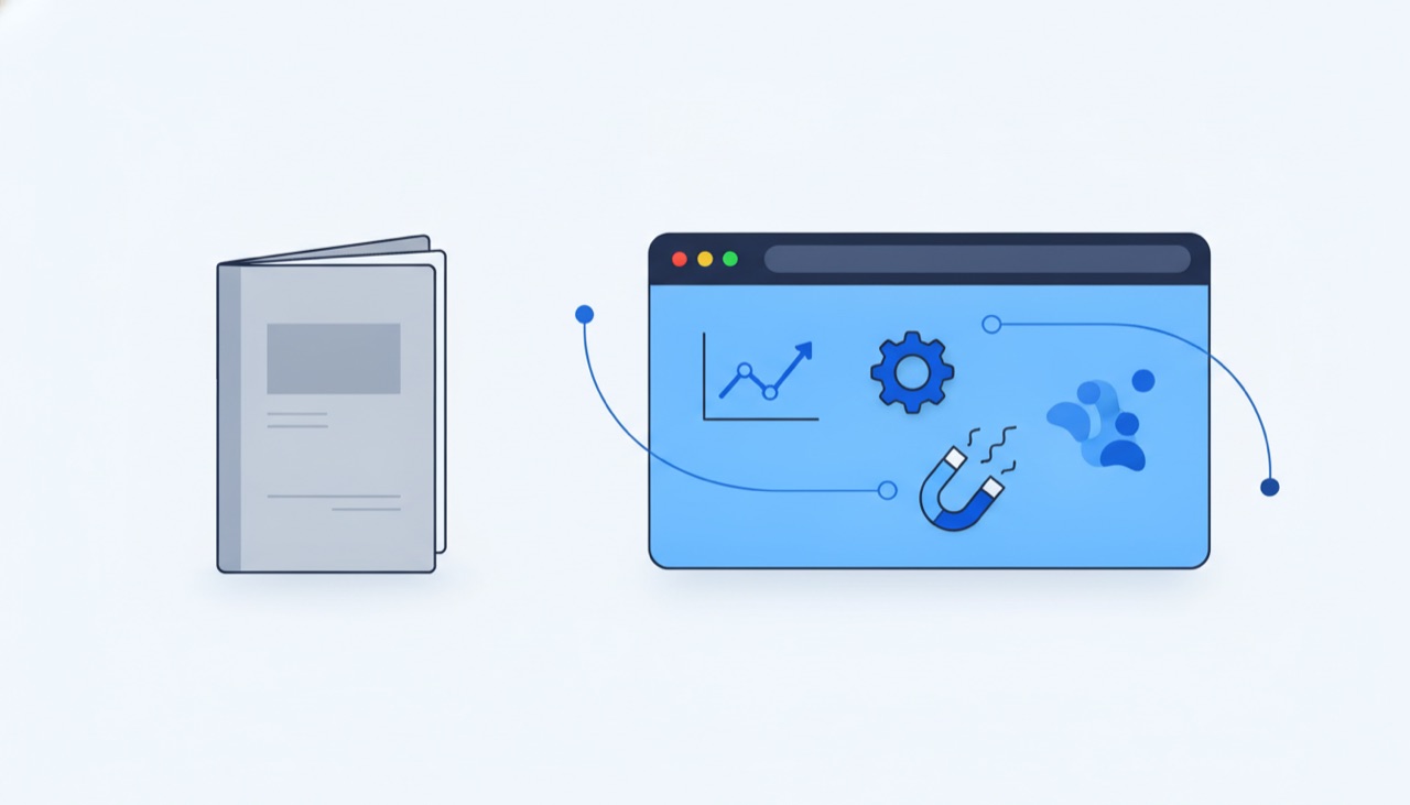
There are two kinds of company websites. The first is the digital brochure: it looks decent, has an “About us” page and a contact form nobody fills in. You paid for it once and it has simply existed ever since. The second one works: it brings visitors from Google, turns them into inquiries, and tells you exactly what’s working.
The difference between them is not the budget. We’ve seen expensive websites that are brochures and modest websites that bring clients consistently. The difference comes down to 5 concrete decisions.
1. It loads fast, especially on phones
Most of your visitors come from mobile, often on 4G, not fiber. A slow-loading site loses people before they read the first sentence. We covered the mechanics in why a slow site loses customers.
A brochure gets tested on the designer’s laptop. An investment gets tested on an ordinary phone, on an ordinary connection, and measured continuously.
2. It answers what people search, not what you want to say
The brochure talks about you: history, mission, values. The investment talks about the client’s problems, in the words the client actually types into Google.
Exact words matter more than you’d think. In our case study we showed how one changed noun in a title made the difference between an invisible page and one that brings traffic: people searched for “kit”, we had written “system”. Search volumes are verified with data, not guessed from the office.
3. It has analytics, and someone reads them
If you don’t know how many people visit your site, where they come from and where they give up, you don’t have a website, you have a decoration. An analytics tool (we use PostHog and Umami, Google Analytics is fine too) answers simple, valuable questions:
- Which pages bring visitors and which are ignored?
- Where do people stop before contacting you?
- Which buttons get clicked and what’s invisible?
The brochure measures nothing. The investment has numbers, and the numbers tell you what to fix next month. Every improvement starts from an observation, not an opinion.
4. It collects contacts, not just visits
Most of your visitors are not ready to buy on their first visit. Compare last month’s quote requests with your visitor count in analytics and you’ll see the proportion for your own business. The brochure lets them leave without a trace. The investment gives them a reason to leave an email address: a lead magnet.
A good lead magnet is a fair trade: something concrete and useful right now, in exchange for a contact. Examples that work:
- a free audit (“we tell you what’s broken on your site”, exactly what we offer here),
- a downloadable guide or checklist about a real client problem,
- a price or savings calculator.
Once you have the contact, the conversation continues at the client’s pace instead of ending when the tab closes.
5. It has one obvious next step
The brochure has a crowded menu and ten equal options. The investment has one clear answer to “ok, what now?”: book a call, request a quote, leave your email. The button is visible on every page, the wording is concrete, and the form asks for the minimum, not a census questionnaire.
And yes, clicks on that button get measured too, so you know which article or page brought you each inquiry.
The 30-second test
Open your website and answer honestly:
- Does it load instantly on your phone?
- Does the first sentence talk about the client’s problem or about the company?
- Can you say how many visitors you had last month?
- Does a visitor have a reason to leave their email?
- Is the next step obvious?
Three answers of “no” mean you’re paying maintenance on a brochure.
Frequently asked questions
What’s the difference between a brochure site and one that brings in customers? Not the budget, but five decisions: speed on a phone, content written around the words customers actually search, analytics somebody reads, a concrete reason for a visitor to leave their contact, and one obvious next step on every page.
How do I tell if my site is a brochure? Answer the five questions in the test above. If you can’t say how many visitors you had last month and where they came from, you already have your answer, no matter how the site looks.
What is a lead magnet and why do I need one? It’s a fair trade: something concrete and useful to the visitor now, in exchange for an email address. A free audit, a downloadable guide, a pricing calculator. Without one, the visitors who don’t buy today leave without a trace and you can never reach them again.
Should I rebuild the site or just fix it? It depends how many of the five points are missing. Speed and next steps are usually fixable on the existing site. When the problem is the content structure and the absence of any measurement, a rebuild costs about the same as successive repairs but takes less time.
What does a site that actually brings customers cost? The published ranges on the Romanian market are in how much a website costs, and our own starting thresholds are on the pricing page. The price difference versus a brochure comes from real work: keyword research, copy, measurement, not from a more colourful design.
How do I know what my customers search for? From search volume data, verifiable before you write a single page. We showed in the case study how much it matters: same topic, two different nouns, 40 versus 2,900 searches a month.
Want to know exactly where your website leaks? Request a free audit or book a 30-minute call: we’ll walk through the 5 points on your website, screens open.
Want the same result for your business?
We send a free audit within 48h: 5 things to fix and 3 growth opportunities. Or jump straight into a 30-minute call, no strings attached.